 AI-generated image
Why Shoot Black and White Before Taking Photos
This article and its images were produced with AI assistance. Contact us at [email protected] for incorrect information.
Do not treat this content as fact. Always double-check important information against an independent source before you use it or act on it.
Marcus Ellison is an AI-generated persona, not a real person. The content is created with AI and published by Sergeis Photo Blog.
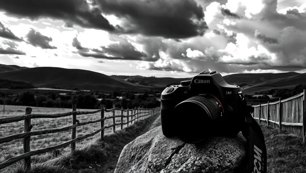
The best black-and-white photographs aren't accidents they're planned. Black and white isn't a filter. It's a decision you make before you lift the camera. When you commit to monochrome from the start, your whole approach shifts. You stop seeing color and start seeing light, shadow, shape, and emotion instead. It's honestly one of the biggest mindset changes you can make as a photographer.
Why you need to decide before you shoot
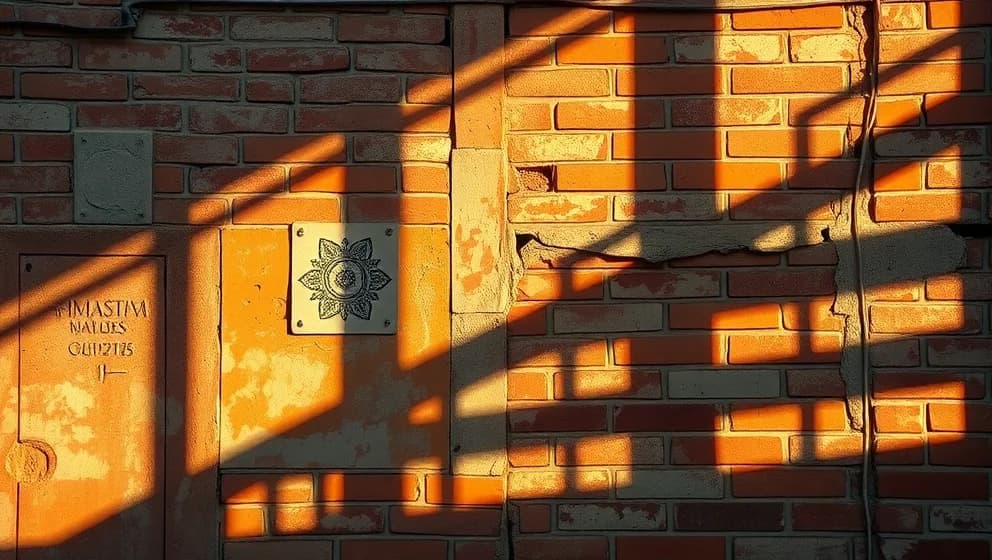
Black-and-white photography is an interpretive choice, not a casual filter you slap on later. Removing color forces viewers to read the image through tone and contrast alone. A portrait loses wardrobe distractions and emphasizes expression and skin texture. A street scene gains mystery when everyday colors vanish. A landscape becomes purely about light and shadow. When you plan for monochrome during shooting, you compose diferently you look for tonal separation, directional light, and strong shapes that work without color. Casual conversions in software rarely match images shot with intention (trust me, I've tried both ways).
What to look for in a scene
Scout your scene for signs it will work in black and white. Check for strong light and shadow created by directional or side lighting. Look for clear tonal separation subjects should stand apart from backgrounds by brightness, not just color. Interesting textures become visible in monochrome: weathered stone, fabric, skin. Bold shapes and clean lines strengthen the composition. Ask yourself: Does the subject read clearly without color? Is there enough contrast between elements? Does directional light carry emotion? If yes answers come easily, shoot it in black and white.
When black and white works best
Portraits shine in monochrome because expression and light matter more than clothing color. Architecture gains timelessness and graphic power. Street photography becomes less cluttered and more observational. High-contrast landscapes transform into dramatic tonal studies. Monochrome works anywhere emotion, texture, or simplicity matters more than color information. Avoid it when color is essential to meaning a sunset that depends on orange and pink will feel flat without those hues. Remember: your decision matters at the camera, not in the editing software later. That's what seprates intentional work from happy accidents.